UX UI Case study: Starbucks pre-ordering and pick up App

Introduction
The product is a result of my personal experience of Starbuck’s crowded queues that caused me to be late for classes many times just for a cup of coffee. the main aim of the project is to solve the problem of Starbucks ’ queue by introducing an app that enables them to pre-ordering their coffee and avoid the crowded queue. I worked on this project with my team members Reem, Sara and Maryam.
Project duration: 1 Week
Research insights and findings
Insight from disk research
- 50% of Starbucks customers around the world complained about the crowded queue over the years.
- based on Starbucks customer's review the crowded queue affected the quality of their drinks.
Interview insights
- They prefer to take their orders via the drive-through.
- They dislike crowded places.
- They value their time.
- they are tech-savvy.
- They care more about quality and taste.
Affinity map

Problem statement:
We dedicated the problem statement from the insights we gathered through our affinity map. The problem statement states that:

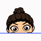
Our persona
Here’s a persona sample of a perfect user from our clients.

The solution:
After conducting our interviews and desk research on this matter, we have come up with a digital app that will reduce such long queues for Starbucks customers. The app allows the user to pre-ordering and receives a unique barcode that’s scannable by our insulated boxes to pick up as soon as he arrives. This results in customers transitioning from direct order to online order, which will magnificently help reduce queues size and surly waiting boredom.
user flow:
After the research, we decided to start building our UserFlow with important tasks highlighted and then sketch it. We used an app called Miro to work together.

Sketches:
We did the sketches to communicate the ideas between the team members and visualize the application features and screens.

Wireframes:


Key features:
- Nearest branch according to the current location.
- Pick up now or schedule it!
- QR code to personally pick up your order from our insulated boxes the moment you arrive. No more waiting in queues.
- Your order will be placed in one of our insulated boxes that keep it warm\ cold.
Lo-fi Paper Prototype:
The user had no problems testing and interacting with the paper prototype. They stated that the interaction was simple, and they were familiar with all the elements.

Paper prototype video:
Branding

Logo

So what could be next?
- Comparing the outcomes after launching the app with the initial state before trying to solve the problem.
- Adding a “Group order” feature which enables groups who work in the same place to schedule and arrange orders for a faster pick up.
- Adding a “Community” feature that enables users to share their photos and thoughts about their experience with the app.